
Confusing Navigation That Loses Customers (Part 2 of 5)
Last week, we examined how hidden contact information costs businesses customers. Today, we're tackling an even more widespread problem: navigation that confuses rather than guides.
In my experience, clever navigation is often the enemy of effective navigation. The goal isn't to impress visitors with creative menu structures. It's to help them find what they need quickly and easily.
The Navigation Trap
The Problem:
Your website navigation uses creative labels, has too many options, or organises information in ways that make sense to you but confuse customers.
Real-World Example:
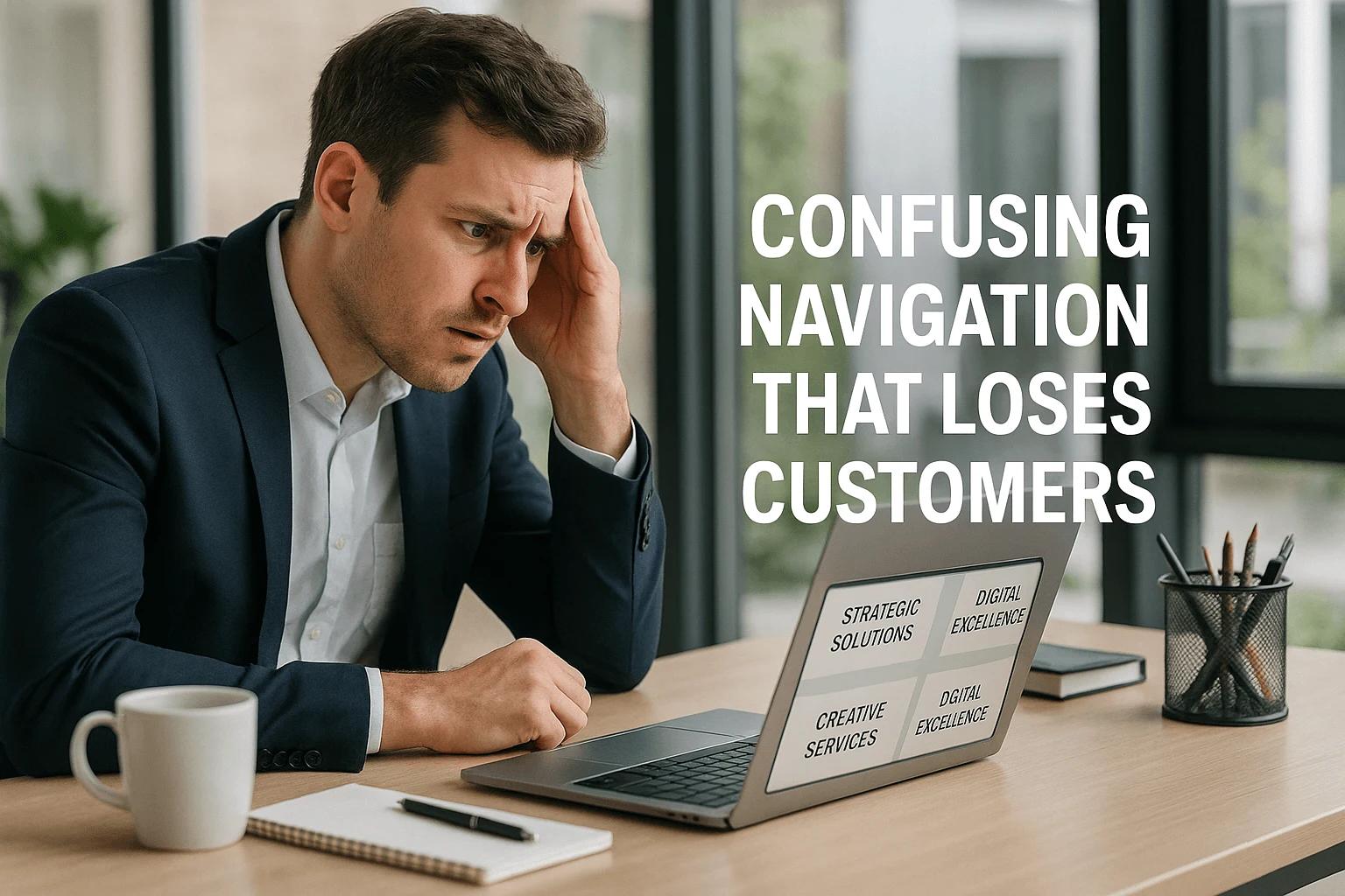
A Cork-based marketing agency had organised its services menu around its internal team structure: "Strategic Solutions," "Creative Services," and "Digital Excellence." Clever? Perhaps. Clear? Absolutely not.
Potential clients couldn't figure out whether website design fell under "Creative Services" or "Digital Excellence." Many gave up and contacted competitors with clearer service descriptions.
The Hidden Costs:
- Visitors who can't find relevant services assume you don't offer them
- Frustrated users who abandon your site for clearer competitors
- Reduced time spent on site, hurting SEO performance
- Lost sales from customers who can't navigate to purchase pages
Why Navigation Goes Wrong
1. Internal Perspective Bias
You know your business inside out. What seems obvious to you might be completely unclear to customers encountering your services for the first time.
2. Trying to Be Clever
Creative menu labels might win design awards, but they often fail the basic test: helping customers find what they need.
3. Too Many Options
Research by psychologist Barry Schwartz shows that too many choices can paralyse decision-making². This applies directly to website navigation.
4. Inconsistent Organisation
Mixing different organisational principles (by service type, by industry, by price point) creates confusion about where to find specific information.
The Cost of Confusion
Measurable Impacts:
- Higher bounce rates as visitors can't find relevant content
- Lower conversion rates due to navigation friction
- Reduced page views per session
- Decreased customer satisfaction and trust
Business Impact:
One client's website analytics showed that 60% of visitors were leaving from their services page without clicking deeper. The problem wasn't the services themselves, but the navigation that made it unclear how to learn more about specific offerings.
Navigation That Works
Principle 1: Use Customer Language
Your navigation should use terms your customers use, not internal jargon or creative interpretations.
Example:
- Instead of "Solutions," use "Services"
- Instead of "Insights," use "Blog" or "Articles"
- Instead of "Connect," use "Contact"
Principle 2: Limit Top-Level Options
Research suggests 7±2 items as the optimal number for human memory³. Your main navigation should reflect this limitation.
Principle 3: Logical Hierarchy
Organise information the way customers think about it, not the way your business is structured internally.
Principle 4: Consistent Patterns
Use the same organisational logic throughout your site. If you organise by service type in one section, maintain that pattern elsewhere.
Practical Implementation
Step 1: Customer Journey Mapping
Before restructuring navigation, understand how customers actually search for and evaluate your services.
Questions to Ask:
- What terms do customers use when describing your services?
- What's the logical order for discovering your offerings?
- What information do they need before making contact?
Step 2: Navigation Audit
Test your current navigation with people outside your business. Can they find key information quickly?
Step 3: Simplification
Reduce options to essential categories. Use dropdown menus sparingly and only when they genuinely help the organisation.
Step 4: Clear Labels
Choose navigation labels that immediately communicate content. Avoid clever wordplay or internal terminology.
Real-World Solution
Before: Strategic Solutions | Creative Services | Digital Excellence | Insights | Connect
After: Web Design | Marketing Services | SEO | Case Studies | Contact
The "after" version immediately tells visitors what services are available and where to find specific information.
Testing Your Navigation
The 5-Second Test:
Show your homepage to someone unfamiliar with your business for 5 seconds. Can they tell you what services you offer and where to find more information?
The Task Test:
Ask someone to find specific information on your site (like pricing for a particular service). Time how long it takes, and note where they struggle.
The Mobile Test:
Navigation that works on desktop often breaks down on mobile. Test your navigation on actual mobile devices, not just desktop browser windows made smaller.
Common Navigation Mistakes
1. Dropdown Overload
Massive dropdown menus with dozens of options overwhelm rather than help.
2. Unclear Service Descriptions
Menu items that don't clearly indicate what customers will find when they click.
3. Buried Important Pages
Key information, like pricing or contact details hidden several levels deep.
4. Inconsistent Naming
Using different terms for similar concepts across different pages.
Quick Wins
Immediate Improvements:
- Replace jargon with customer-friendly terms
- Reduce main navigation to 5-7 key items
- Add clear service descriptions to dropdown menus
- Ensure contact information is always accessible
- Test navigation on mobile devices
Measuring Success
Key Metrics:
- Reduced bounce rate from key pages
- Increased pages per session
- More time spent on site
- Higher conversion rates from navigation clicks
Business Metrics:
- Increased enquiries about specific services
- More qualified leads (people who understand your offerings)
- Reduced customer service questions about basic information
What's Next
In Part 3 of this series, we'll examine mobile disasters that kill conversions. You'll learn why mobile-friendly isn't enough and what mobile-first really means for your business.
The navigation principles we've covered today apply equally to mobile, but mobile introduces additional challenges that can cost you customers.
Take Action This Week
Audit your navigation using the tests outlined above. If customers can't quickly find what they need, fix it before moving on to other website improvements.
Navigation is the foundation that makes everything else work. Get this right, and other improvements become more effective.
Need help restructuring your website navigation? Book a consultation where we'll map your customer journey and create navigation that actually helps your business.
Next Week: Part 3 - Mobile Disasters That Kill Conversions
Missed Part 1? Read about Hidden Contact Information That Costs Sales
Sources:
2. Schwartz, Barry. "The Paradox of Choice," 2004
3. Miller, George A. "The Magical Number Seven," Psychological Review, 1956
About the Author: Patrick Ryall has been building websites since 1994 and running businesses for over 30 years. He specialises in creating navigation that serves business goals, not just design aesthetics.