

It needs to explain a product that may be technical, unfamiliar or difficult to show in a few words, and help a visitor understand whether the software is relevant to their business, what problem it solves and what changes after implementation.
It also needs to give sales teams better-qualified conversations, without forcing every visitor into a demo before they are ready.
Most software buyers now research products independently. They compare options, look for evidence, check integrations, investigate pricing and try to understand how a system would fit their existing business before speaking to anyone. A SaaS and business software website should support that research.
Make the product easier to understand, the business case easier to assess and the next step easier to choose.
The problem with most software websites
Many software websites are written from the inside out. They lead with the company, the technology, the number of features or a statement about transformation. The language may sound impressive, but the visitor is still left wondering what the software actually does and whether it is suitable for their situation.
A software buyer is usually trying to answer more practical questions:
- What does this product help me do?
- Is it designed for a business like mine?
- Which problem does it solve better than the current approach?
- How would it fit with the tools already in use?
- How long would implementation take?
- Can the team learn and adopt it?
- What does it cost?
- What happens if the product is not suitable?
- Can the product be trusted with important business data?
If the website does not answer these questions, the buyer has to look elsewhere: a competitor’s website, a review platform, a search result or a conversation with someone who has already made the decision.
A good SaaS website does not hide the product behind polished language. It brings the product, its use cases and its business value into view.
A sales-led website for software companies
A sales-led website should not treat every visitor as a ready-to-buy lead. Some visitors are learning about a problem. Some are researching a category. Some are comparing products. Some already know the solution they want and are looking for evidence that the software can work in their business. Each visitor needs a different next step. That may be:
- Reading a product overview
- Exploring a use case
- Viewing an interactive product tour
- Comparing an integration
- Understanding implementation
- Reviewing a customer story
- Checking pricing or packaging
- Booking a sales conversation
- Starting a free trial
- Requesting technical information
A single Book a Demo button is not a complete conversion strategy. It is one option in a wider buying journey.
A sales-led SaaS website creates enough understanding and confidence that a demo becomes more useful when it happens. The sales team spends less time explaining the basics and more time discussing fit, value and implementation.
Turn technical features into business value
Features are not meaningless. They are simply not the whole argument. A feature becomes commercially useful when the buyer can understand what it changes in their working day or business operation.
The website should connect the capability to the problem, the user and the result. That is stronger than presenting a long list of tools with no context. A useful product page often explains:
The situation
What the user is dealing with today.
How it works
The way the software works in that situation.
Who benefits
The people or teams it helps.
The improvement
The operational change the software supports.
The evidence
Proof the product does what it claims.
The next step
For someone who wants to assess it properly.

This is where software marketing stops sounding like a specification sheet and starts becoming useful sales communication.
Help buyers self-educate before they speak to sales
Software buyers want to reduce risk before they provide contact details or commit to a meeting. That is reasonable. A demo takes time. A trial takes effort. A new system may involve colleagues, data migration, training, procurement and a change to established habits. The website should therefore make early research easier. Useful self-serve content may include:
- A clear product explanation above the fold
- Screenshots or product tours that show how the software works
- Feature pages written around tasks and use cases
- Industry or role-specific pages
- Integration pages for important connected systems
- Implementation and onboarding information
- Pricing guidance or a clear explanation of how pricing works
- Security, privacy and data-handling information
- Customer stories with specific problems and outcomes
- Comparison pages for relevant alternatives
- Practical guides that answer common buyer questions
Not every company needs every type of page on day one. The principle is straightforward: do not ask for a sales conversation before giving the buyer enough information to understand why the conversation may be worthwhile.
Website structure based on how buyers search
SaaS buyers do not only search for company names. They search for problems, categories, use cases, integrations and comparisons. A search-led software website can build visibility across that journey.
People who understand the problem but have not yet chosen a software category.
- How can a business reduce manual reporting?
- How can a clinic manage appointments and patient information?
- How can a team replace spreadsheets for workflow management?
- How can a company bring customer data into one system?
Help the buyer understand the type of product available and where the software fits.
- Business workflow software
- Appointment management software
- Customer management software
- Inventory management software
- Reporting and analytics software
- Online booking software for clinics
Often more persuasive than a general features page, because they speak to a recognisable working context.
- Software for multi-location businesses
- Workflow software for operations teams
- Booking software for aesthetic clinics
- Customer management software for service businesses
- Reporting software for growing companies
A buyer thinking about implementation. Explain what the connection enables, what information moves between systems and what the customer needs to set it up. A logo wall is not an integration strategy.
Closer to a decision, but more cautious. Comparison pages should be accurate, fair and specific, and help the reader understand where each approach is suitable rather than pretending every alternative is useless.
- Product A versus spreadsheets
- Software category A versus category B
- Building custom software versus using SaaS
- Platform alternatives for a specific business type
- What to look for in a particular kind of business software
This structure supports both search visibility and sales conversations, because it follows the questions buyers already ask.
InvoiceSent
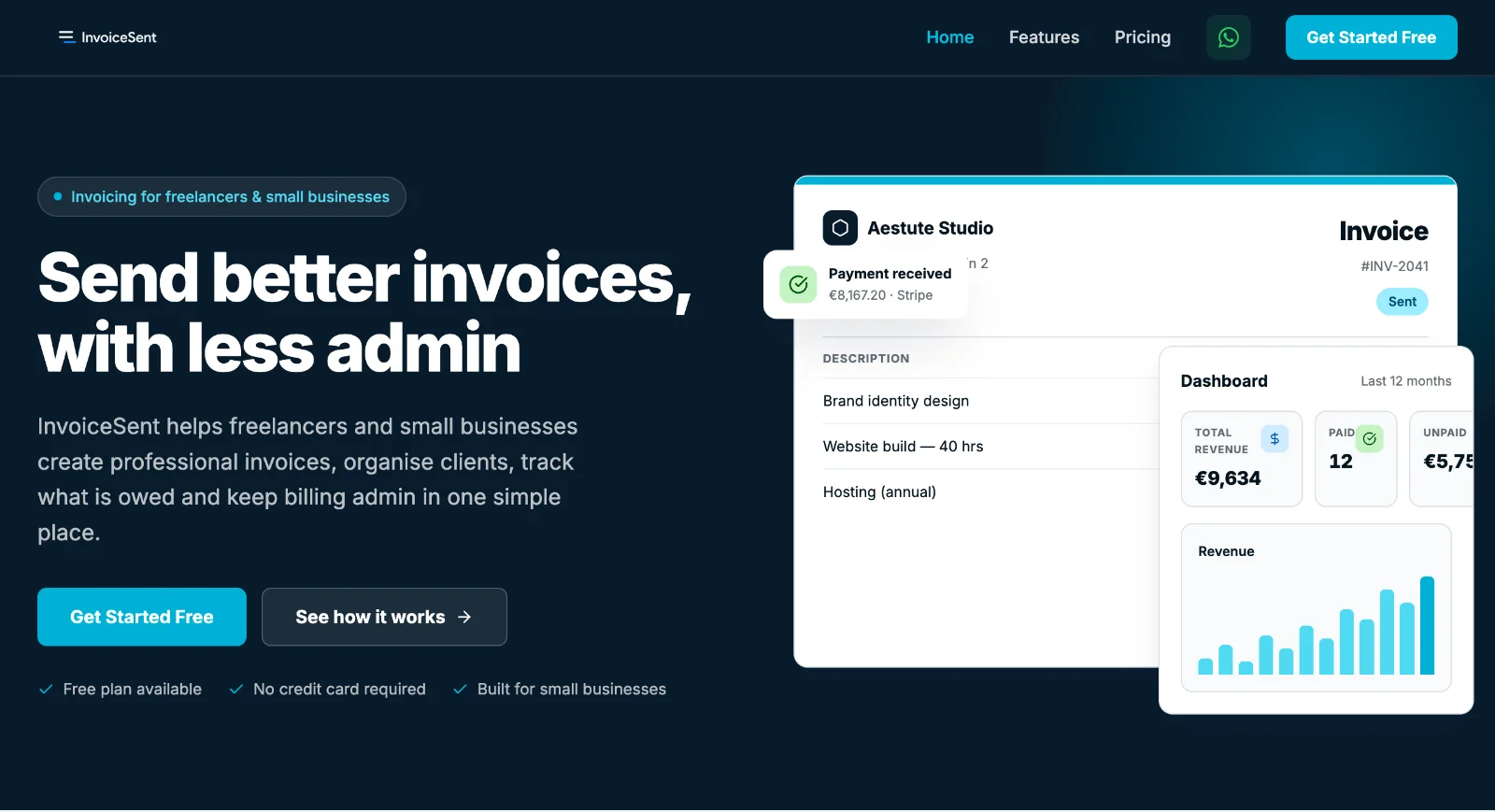
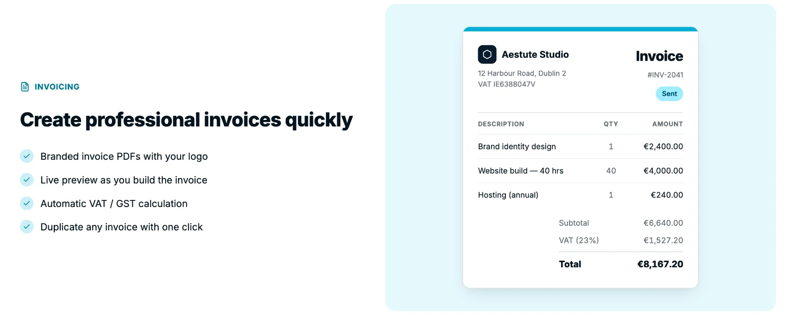
A product-led site where the product is on screen before the first scroll.
The headline says what it does and who it is for. A free plan removes the barrier to trying it, and each capability is shown working rather than listed.
View the projectUniUrl
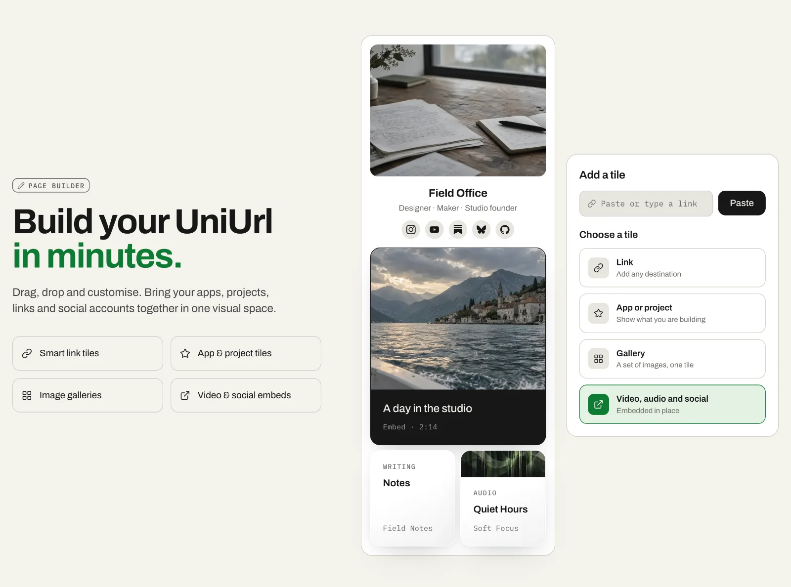
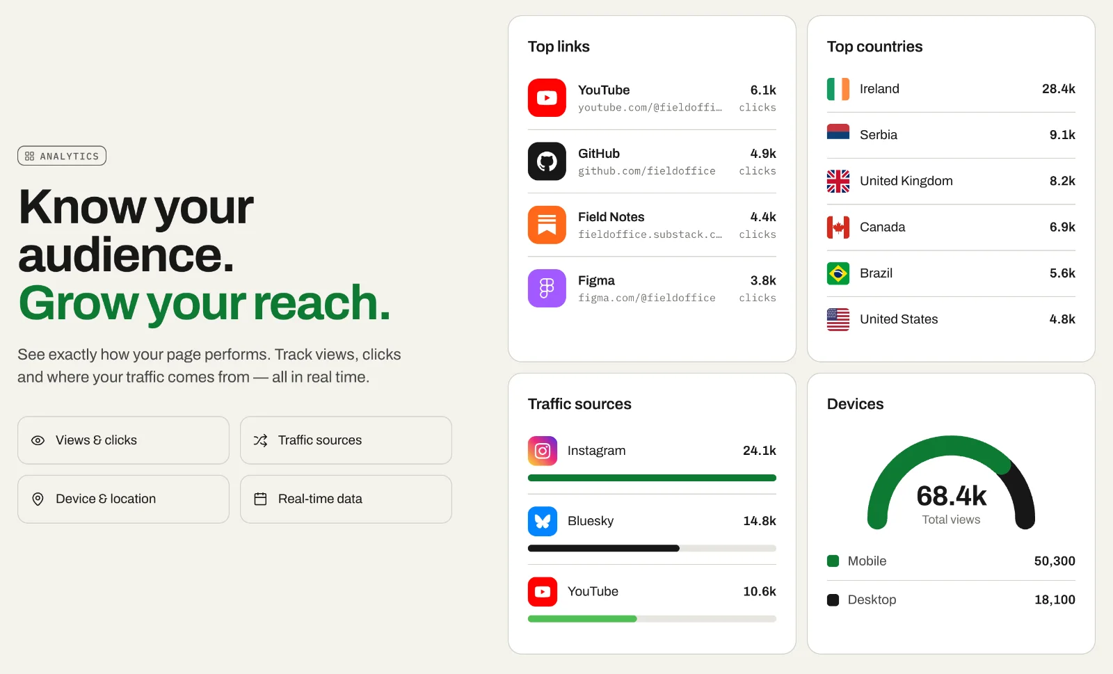
Self-serve from the first line: claim a handle, then see exactly what you get.
Each feature section pairs a short claim with the interface itself, from the page builder to analytics, so the visitor sees the product before signing up.
View the projectWord Presto
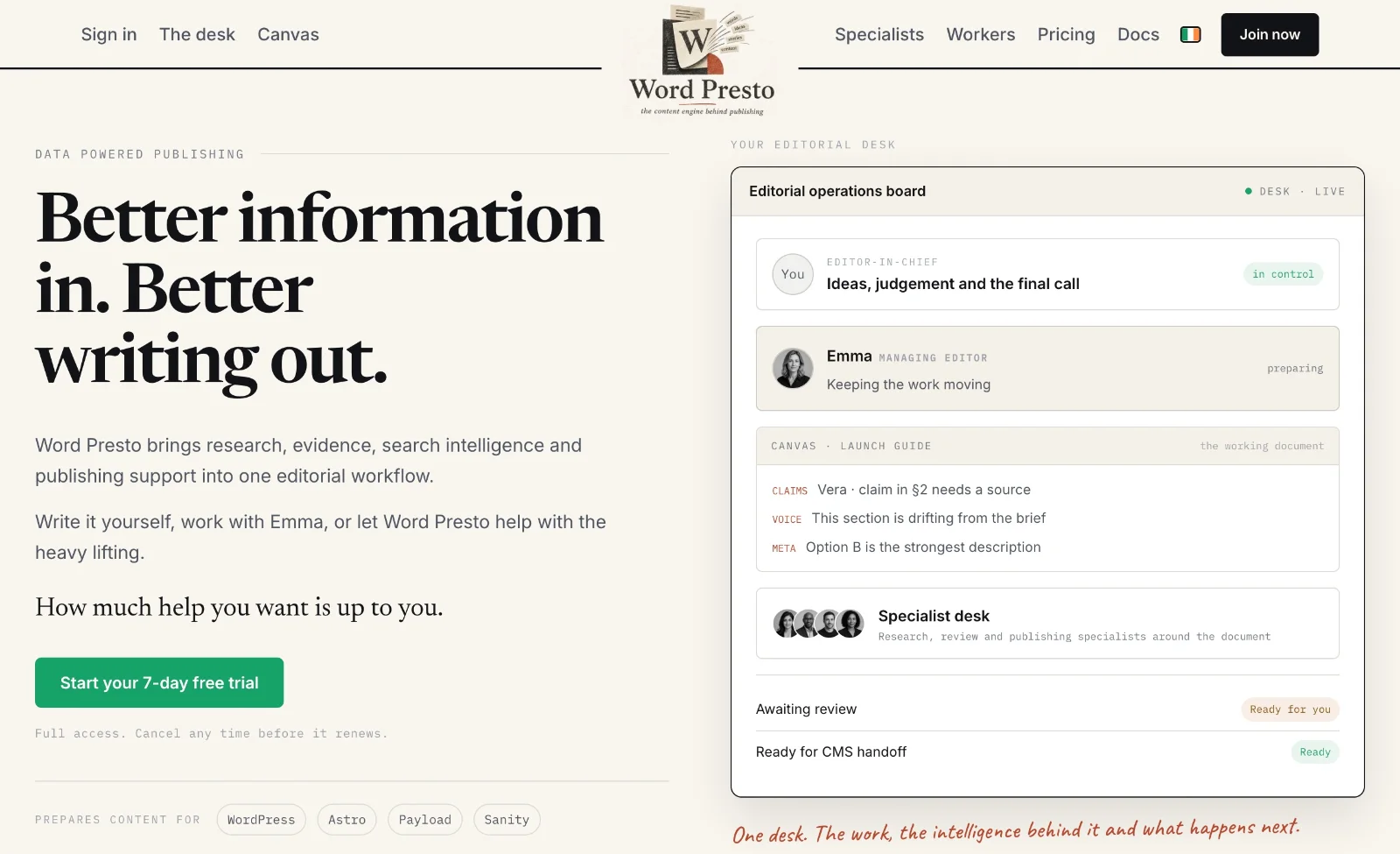
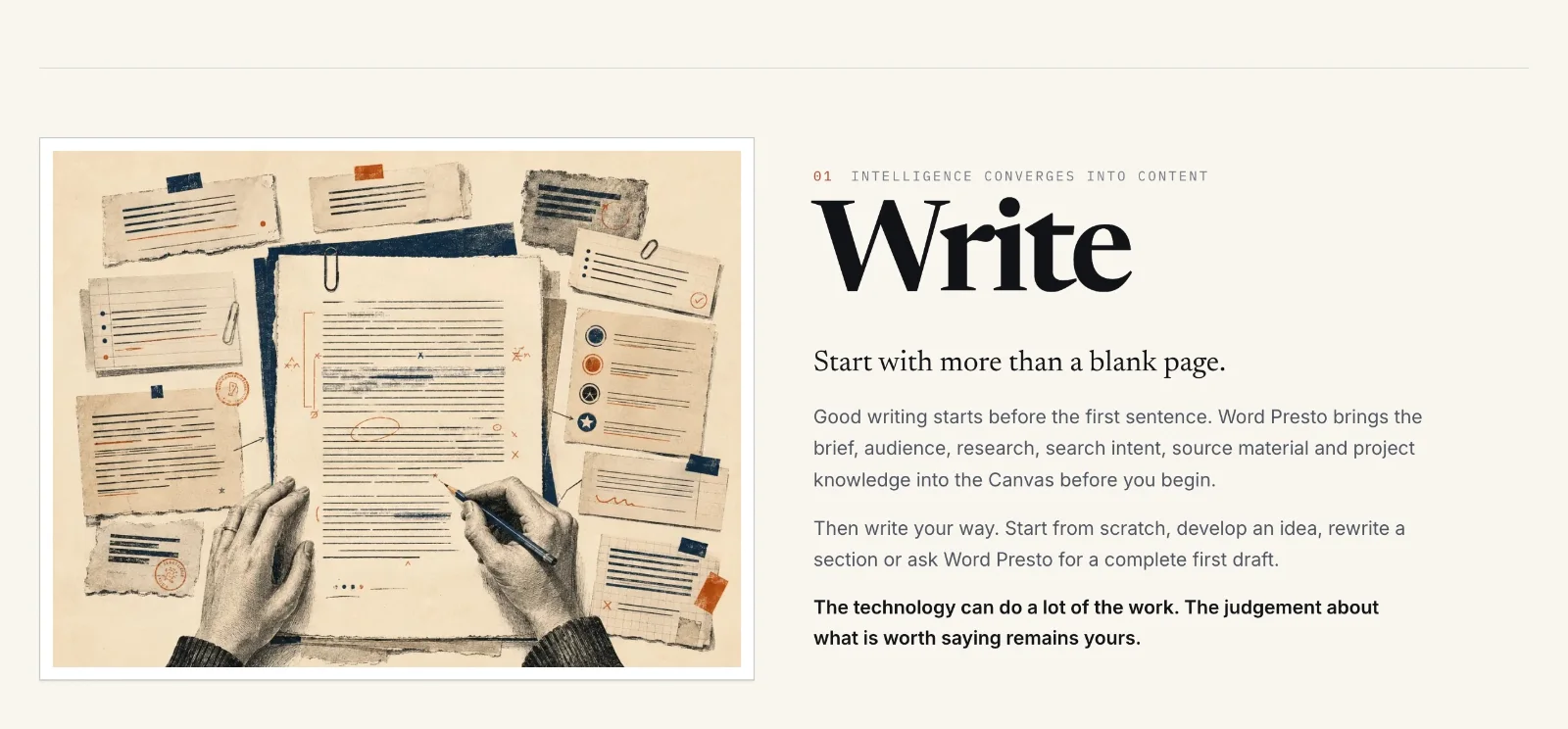
An unfamiliar category, explained one stage of the job at a time.
Write, publish, engage, rank and track each get their own section, so a new kind of product reads as a familiar workflow. A seven-day trial is the next step.
View the projectAestuteOS
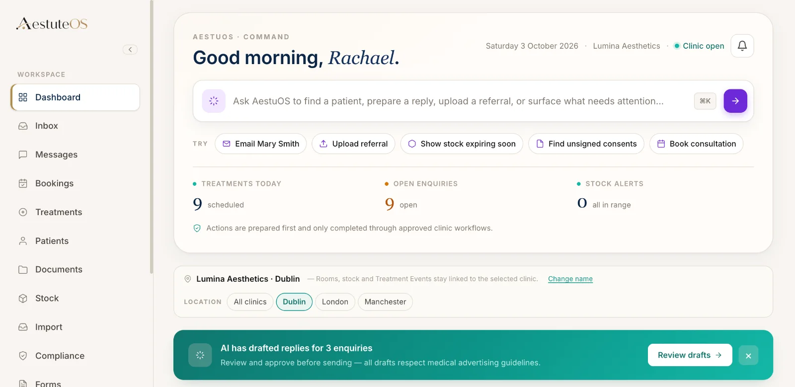
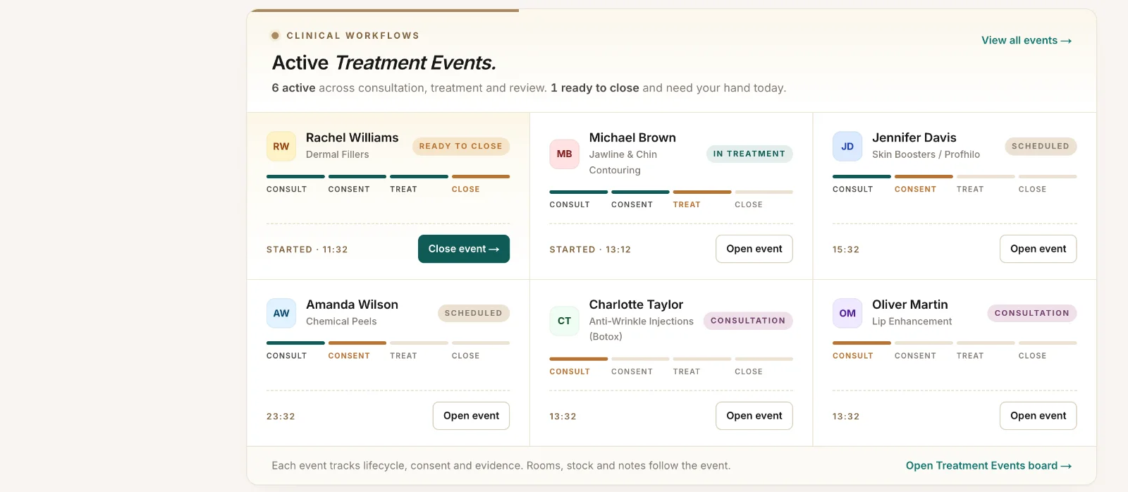
Sales-led software for a regulated sector, where trust and workflow matter more than features.
The site explains the clinical record at the centre of the product, then shows the working day around it. Buyers can judge fit before they book a conversation.
View the projectThe homepage should pass the sniff test
A homepage is not supposed to explain every detail of a SaaS product. It should make the right visitor want to understand more. Within a few seconds, the visitor should be able to identify:
- Who the software is for
- What the software helps them do
- The problem or cost of the current approach
- The main benefit of changing
- The best next step for their stage of research
A useful homepage structure might look like this:

The homepage should not make a visitor decode the business model. Software is complex enough without making the website another puzzle.
Product pages that support conversion
A strong product page gives the buyer a reason to continue. It does not merely announce that a feature exists. A useful product page can show:
- The job the product helps the user complete
- The old way of completing that job
- The new workflow inside the software
- The teams or roles that use it
- The information required to get started
- The integrations or dependencies involved
- The practical benefit of using the capability
- A relevant proof point or example
- A clear call to action
Product pages should also be easy to scan. Headings, diagrams, screenshots, short sections and direct answers make it easier for a buyer to find the information that matters to them.
For a technical product, that does not mean removing detail. It means organising detail so different people can find what they need. A business owner may care about efficiency and return. An operations manager may care about workflow. A technical evaluator may care about security, APIs and data architecture. The website needs to support all three without becoming unreadable.
Show the software instead of talking around it
Software buyers trust a real product experience more than a collection of vague promises. Depending on the product, that experience may include:
- An interactive product tour
- A guided workflow demonstration
- Annotated screenshots
- A short, focused video
- A sandbox or free trial
- A sample report or dashboard
- A product comparison tool
- A clear explanation of the onboarding journey
The aim is not to overwhelm people with a full technical demonstration. It is to give them enough visibility to understand how the software behaves and whether it seems relevant. A product tour is particularly useful for visitors who are not ready to speak with sales but want to see the software working.
Build trust around risk, not just ambition
A software purchase is rarely judged on the interface alone. Buyers need to understand the risks of choosing the product. Important trust content may include:
- Customer stories that explain the starting problem and the change made
- Transparent information about support and onboarding
- Security and privacy documentation
- Data storage and processing information
- System availability or service status where relevant
- Integration and API information
- Clear pricing or packaging guidance
- Terms, contracts and cancellation information
- A credible team and contact route
- Evidence from customers with similar needs
The strongest case studies are specific. They explain what the customer was trying to improve, what they changed, how the product was used and what happened afterwards. A sentence saying a customer is “delighted” is pleasant but not very informative.
Trust grows when the website gives buyers enough information to make a serious assessment.
Content that supports AI search and human search
Search is changing, but the basics of being useful have not disappeared. AI-generated answers and traditional search results both need clear, well-structured information. A software company has a better chance of being understood and referenced when its website explains:
- What the product is
- Who it is for
- Which problems it solves
- How it works
- Which integrations it supports
- What it costs or how pricing is structured
- How implementation works
- How it compares with alternatives
- What customers use it for
Each page should have a clear subject and answer real questions directly. One clear page for a specific search intent is generally more useful than several thin pages that say the same thing in slightly different language.
SaaS website design for different business models
Not every software company sells in the same way.
Sales-led
Strong product education, case studies, implementation information, qualification routes and clear demo options, so a buyer can decide whether a conversation is worthwhile.
Product-led
Free trials, self-serve onboarding, product tours and rapid time to value. Communicate the first useful action and remove barriers to trying it.
Hybrid
Self-serve access for smaller customers and a sales-assisted journey for larger ones. Make both routes clear rather than one generic call to action.
Bespoke business software
A configured platform or tailored implementation. Explain the balance between the core product, customisation, implementation and ongoing support.
A free trial, request-demo form and contact sales button are not interchangeable. Each asks for a different level of commitment, and the website should reflect the commercial model.
What a SaaS and business software website project can include
The right scope depends on the product, audience and sales process. A project may include:
Positioning and messaging
- Audience and buyer research
- Product positioning
- Value proposition development
- Customer language and problem mapping
- Homepage and core-page messaging
- Messaging for different roles or industries
Website structure and design
- Sales-led or product-led website architecture
- Homepage design
- Product and feature pages
- Industry and use-case pages
- Integration and comparison pages
- Pricing and implementation pages
- Responsive and accessible interface design
Product education
- Interactive product tours
- Screenshots and annotated workflows
- Product demonstration content
- Customer stories and proof structures
- Security and technical information layouts
- Trial, demo and contact journeys
Search-led content
- Keyword and search-intent mapping
- Problem-led content
- Product category and use-case pages
- Integration content
- Comparison and alternative pages
- FAQs and direct-answer sections
- Internal linking and content hierarchy
Measurement and improvement
- Analytics and conversion tracking
- Demo, trial and contact-event tracking
- Landing-page testing
- Review of visitor behaviour and sales feedback
- Ongoing content and conversion improvements
The purpose is not to produce a larger website for its own sake. It is to create a website that makes the product easier to buy.
Frequently asked questions
How much does a SaaS website cost?
The cost depends on the product’s complexity, the number of audiences and use cases, the amount of content required, the level of product demonstration, integrations, design requirements and ongoing optimisation.
A focused early-stage SaaS website may need a clear homepage, product pages, a few use cases, a pricing or demo route and strong proof. A mature software company may need a larger content system across industries, roles, integrations, resources, comparison pages and technical documentation.
The sensible starting point is to define the buyer journey, the commercial model and the information buyers need before choosing the page count or platform. A large website with unclear positioning is still unclear. It simply takes longer to load.
How can a SaaS website generate more leads?
A SaaS website can generate more qualified leads by making the product easier to understand and giving visitors a suitable next step at each stage of research.
The practical improvements often include replacing vague headlines with specific positioning, showing the software earlier on the page, explaining use cases instead of listing features, making pricing logic easier to understand, creating pages for important industries, roles and integrations, adding specific customer evidence, offering product tours, giving visitors a clear choice between demo, trial and self-serve education, and reviewing where visitors leave.
There is no universal conversion number that proves a SaaS website is working. The better question is whether the website is creating the right kind of conversations and helping the sales process move forward.
What should a business software website include?
At a minimum, it should explain who the product is for, what it does, which problems it solves and how a buyer can learn more or take the next step.
Depending on the product, it may also need product pages, use cases, integrations, pricing, implementation details, security information, customer stories, FAQs, technical documentation and comparison content. The final structure should reflect what buyers need to decide, not what internal departments want to publish.
Should a SaaS website show pricing?
There is no single correct answer. Some SaaS products can show clear prices and packages. Others require configuration, usage estimates, implementation or enterprise negotiation.
In either case, the website should explain enough for a buyer to understand how pricing works and what influences the cost. Hiding every pricing detail can create unnecessary uncertainty. Publishing a misleadingly simple price can create a different problem. The right approach is clarity, even when the final figure depends on the customer’s requirements.
Build a software website that makes the product easier to choose
Bring the product into view, explain the practical value, support independent research and give the sales team a better starting point. The objective is not to make the software sound bigger than it is. It is to make the value easier to see.